CSS property: box-decoration-break
Description
Behavior when a box is broken at a page break.
When a box is broken at a page break, column break, or, for inline elements, at a line break, the box-decoration-break property specifies whether individual boxes are treated as broken pieces of one continuous box, or whether each box is individually wrapped with the border and padding. For backgrounds it defines how the background positioning area is derived from these multiple boxes and how the element's background is drawn within them.
slice, on the right the value clone.Syntax
box-decoration-break: slice | clone;
Values
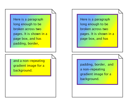
- slice (by default)
No border and no padding are inserted at the break. border-radius has no effect at its corners; and the border-image is rendered for the whole box as if it were unbroken. The effect is as though the element were rendered with no break present, and then sliced by the break afterward.
Backgrounds are drawn as if, after the element has been laid out (including any justification, bidi reordering, page breaks, etc.), all the element's boxes are taken and put one after the other in visual order. The background is applied to the bounding box of this composite box and then the boxes are put back, with their share of the background.
For boxes broken across lines, first boxes on the same line are connected in visual order. Then boxes on subsequent lines are ordered according to the element's inline progression direction and aligned on the baseline. For example in a left-to-right containing block (‘direction’ is ‘ltr’), the first box is the leftmost box on the first line and boxes from subsequent lines are put to the right of it. In a right-to-left containing block, the first box is the rightmost on the first line and subsequent boxes are put to the left of it.
For boxes broken across columns, the columns are treated as one continuous element, as if the column boxes were glued together in the block progression direction of the multi-column element. For boxes broken across pages, the page content areas are glued together in the block progression direction of the root element. In these cases, if the pieces have different widths (heights, if the root element / multi-column element is in vertical text mode), then each piece draws its background assuming that the whole element has the same width (height) as this piece. This ensures that right-aligned images stay aligned to the right edge, left-aligned images stay aligned to the left edge, and centered images stay centered.
- clone
Each box is independently wrapped with the border and padding. The border-radius and border-image are applied to each box independently. The background is drawn independently in each box of the element. A no-repeat background image will thus be rendered once in each box of the element.
Versions
Examples
article {
    border: solid 2px #ccc;
    padding: 2em;
    background: #eee;
    box-decoration-break: clone;
}